
Sidebar
Rebuilding
New approach and standardisation - rescaling Backstage.io navigation to handle growing feature complexity without losing clarity.
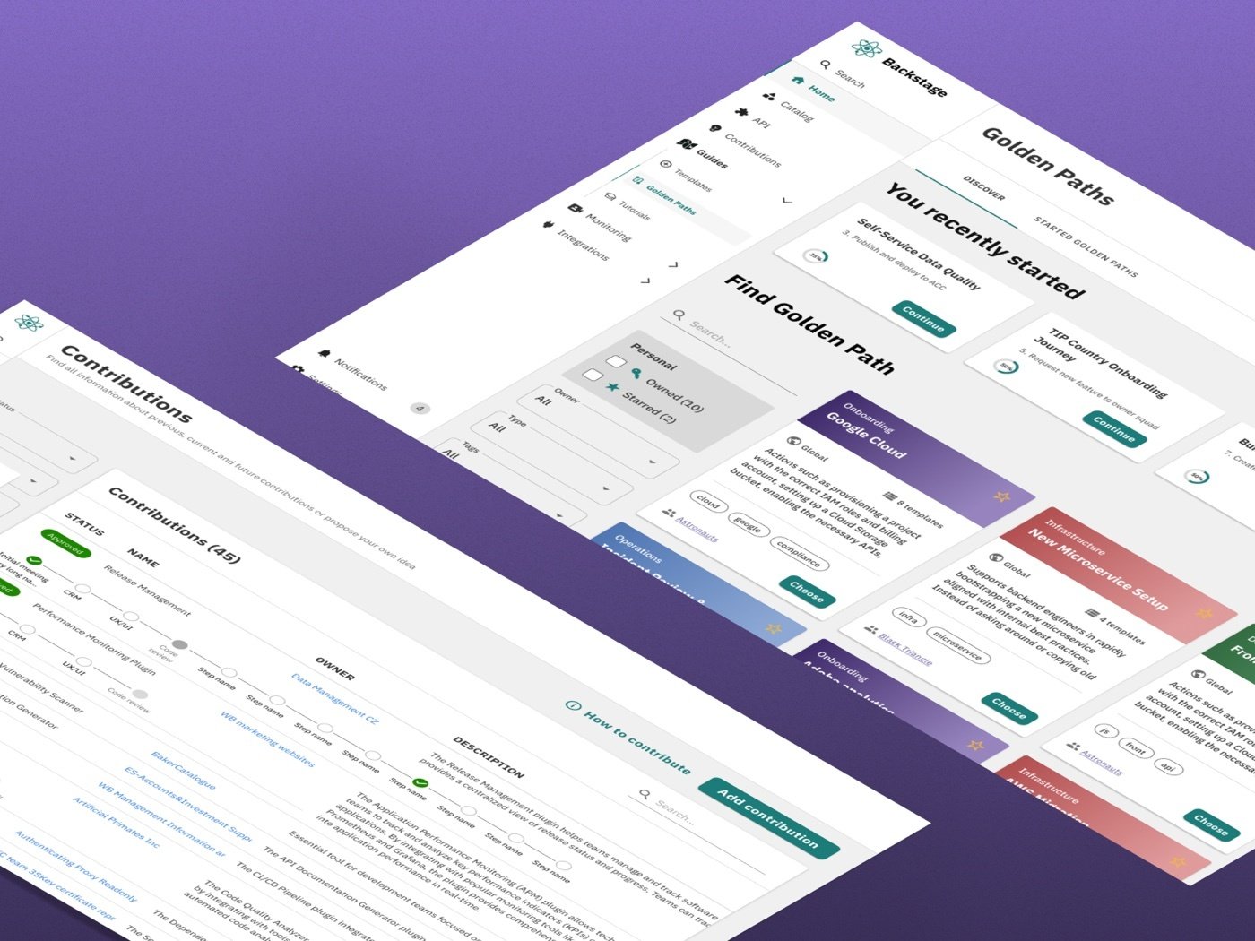
As Backstage.io grew in features and users, the sidebar stopped scaling. What once worked as a simple list became an unnavigable wall of items — forcing users to scroll endlessly and guess where things lived. Worse, there was no standard defining what belonged at the top level versus what should be nested.
I led a full navigation audit and redesign — combining card sorting, benchmarking, and usability testing to create a principled, scalable sidebar system with clear categorisation guidelines.
Hard to navigate.
No standard.
The sidebar gradually stopped scaling with the growing number of features — especially on smaller screens. The Backstage-recommended nested pattern created additional problems: users couldn't determine their current location, and deeper nesting reduced clarity rather than adding it.
- Sidebar too long - users had to scroll to access core features
- No clear hierarchy between items
- Hard to find key actions
- Users lost orientation in nested navigation
"I've been using this for months and I still can't find half the things I need without searching."
Categories from
usage, not assumptions.
Methods used
Key findings
Card sorting with 18 participants revealed three consistent categories that reflected actual usage patterns — not the existing ad-hoc structure. These became the foundation of the new IA.
Benchmarking large-scale applications showed that core plugins at the top and alphabetical ordering for secondary items significantly reduced search time for both new and experienced users.
Reusing similar icons across different items caused users to click the wrong destination. Strict icon standards — one icon per concept, no reuse — resolved this in testing.
A system,
not a list.
The new sidebar is built on clear guidelines that any team can follow — ensuring the navigation stays coherent as the platform continues to grow without requiring a redesign every time a new feature ships.
Design principles
Core plugins appear first. All others are alphabetised. This removes subjectivity from ordering decisions and ensures new additions have a clear, predictable home.
Material UI icons only. No icon reuse. Reserved icons for universal concepts (Home, Search, Check, Cancel). Visual consistency removes guesswork from navigation.
A collapsed sidebar mode accommodates smaller screens and power users who prefer more screen space — without hiding important navigation permanently.
The design,
view by view.
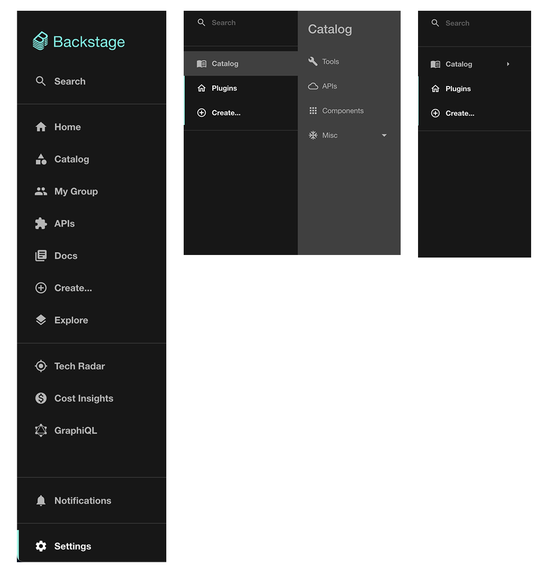
The old navigation
The original sidebar had no hierarchy — items were added ad hoc as features shipped. The result was a growing, unstructured list with no visible logic, requiring users to scroll and guess.
- No standard for what belongs at top level
- Inconsistent icons caused recognition errors
- Forced scrolling to reach core features
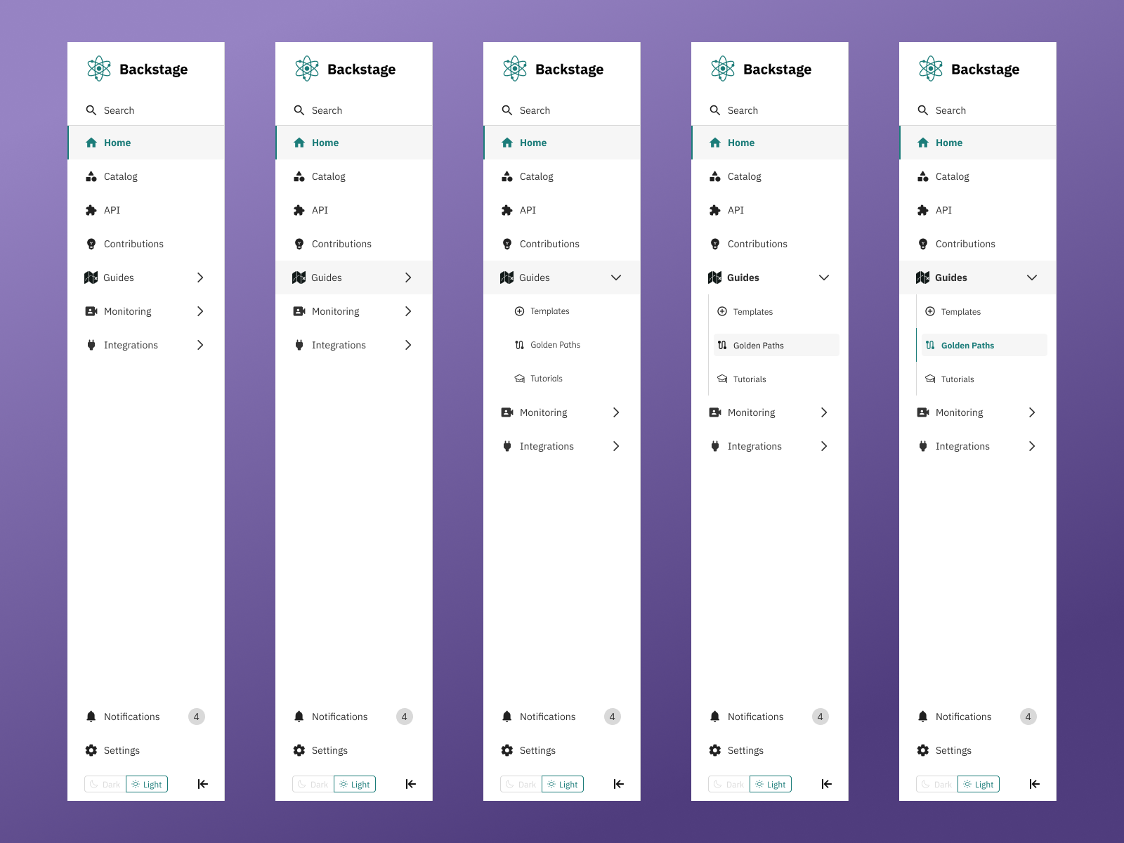
Structured and scannable
The redesigned sidebar groups items into clear categories with consistent iconography. Core items appear first; all others follow alphabetical order — creating a navigation system any new team member can understand immediately.
- Three category groups validated through card sorting
- Strict Material UI icon standards throughout
- Core plugins surfaced at the top level
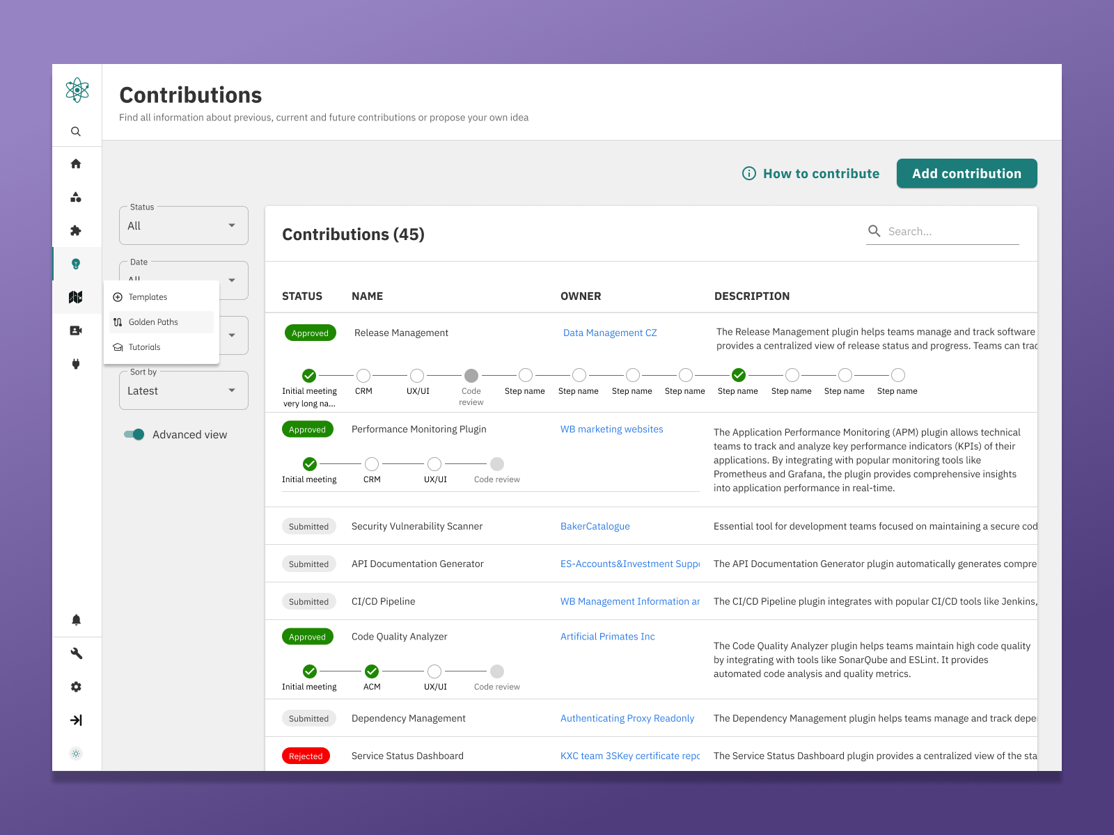
More space when you need it
The collapsed sidebar reduces to icon-only view — giving users more working space without hiding navigation entirely. Tooltips on hover maintain discoverability even in dense, icon-only mode.
- Addresses smaller screen density needs
- Tooltips preserve discoverability in icon mode
- Smooth transition between states
What changed
after launch.
One design version significantly reduced the time users needed to locate functionality — validated through low-fidelity usability testing with internal users before full implementation.
The categorisation and ordering guidelines were reviewed and approved by stakeholders — giving product teams a clear, shared standard for adding new navigation items without breaking the structure.
During implementation, a parallel community-driven sidebar redesign was discovered in the Backstage GitHub. The team paused to track it — a decision that prevented duplicate effort and opened the door for open-source contribution.