
Unicorn
Designs
My own handmade furniture brand — colorful, rounded, and joyfully functional. Clean, visually distinctive e-commerce identity built from the ground up.
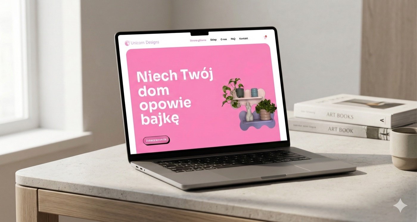
Unicorn Designs is my personal handmade furniture brand - colorful, rounded forms that bring joy into functional objects. Designing the brand and e-commerce presence was both a creative outlet and a real exercise in building a cohesive product identity from scratch.
The challenge was translating the tactile, joyful quality of handmade objects into a digital experience — ensuring the website felt as playful and distinctive as the products themselves, without sacrificing usability or e-commerce conversion.
Handmade joy
online.
Handmade furniture brands often struggle to translate physical craft into digital presence — either looking too polished (losing the handmade feel) or too rough (losing buyer confidence). The brand needed to feel joyful, tactile, and trustworthy simultaneously.
- No existing brand identity — needed to be created from zero
- Products have a distinctive aesthetic that generic templates can't represent
- E-commerce requires trust signals that handmade brands sometimes lack
- Color and form are the brand's core personality — they needed to lead the design
Color-first.
Form-forward.
The Unicorn Designs brand identity leads with color — bold, playful palettes that reflect the furniture's personality — paired with clean, rounded typography and a layout system designed to let the products breathe and speak for themselves.
Design principles
The brand palette is bold and distinctive — not safe or minimal. Colors are drawn directly from the furniture pieces, creating cohesion between product and identity.
Typography, buttons, cards, and layout elements all mirror the rounded language of the furniture — creating visual coherence between the brand system and the products themselves.
Beneath the playful aesthetic, the e-commerce structure is clear and frictionless — product pages, pricing, and contact paths follow established usability patterns so the joy never gets in the way of the purchase.
In progress —
more coming.
Logo, color system, typography, and visual language are defined and documented — ready to apply consistently across all brand touchpoints.
Full product pages, cart experience, and checkout flow are being designed — with a focus on reducing friction while maintaining the brand's distinctive visual personality.